
Lion Blau
Telegram-native
Tap-to-Earn Game
Telegram-native Tap-to-Earn Game

2024–2026
Role: Lead Product Designer, LiveOps, front-end
Dropee is a Telegram-native tap-to-earn game built for fast, repeatable play inside chat. As Lead Product Designer, I shaped the core loop, reusable LiveOps systems, and TGE-ready UX—turning a simple tapping mechanic into a scalable product system for retention, events, and long-term progression.
2024–2026 · Role: Lead Product Designer, UX/UI, LiveOps, front-end

500K+
monthly users
15M+
total users
3M+
connected wallets
#1
DappRadar on TON
5B+
main-wheel spins
Context / Opportunity
Designing games for Telegram, not app stores
Dropee wasn’t designed for app stores. It was designed for Telegram: a chat-native environment where discovery happens through links, forwards, screenshots, and bot messages, and where players expect instant entry with almost no setup. That changed the product challenge. We had to make the game fast to start, light enough to revisit in short sessions, and easy to share—while still deep enough, through progression, economy, and LiveOps, to keep players engaged beyond the first curiosity tap.

The game opens inside Telegram

Role & RESPONSIBILITIES
Owning the game
experience end to end
As Lead Product Designer, I owned Dropee’s end-to-end game experience across the Telegram mini-app, including the core loop, UX flows, LiveOps surfaces, and event visual language. I worked with product and engineering to turn goals like retention, virality, and TGE-readiness into concrete mechanics such as Daily Combo, Question of the Day, and repeatable event surfaces designed for Telegram’s constraints. Beyond core gameplay, I led the design of the LiveOps system and the reusable component language that underpins it—from high-level interaction patterns to production-ready UI details.
Owned
-
Core loop and UX flows
-
LiveOps surfaces and repeatable event patterns
-
Telegram-native interaction design
-
Event visual language and reusable UI components
Partnered with
-
Product strategy, retention, and feature framing
-
Engineering implementation and system constraints
Reusable UI system across core surfaces

Shared buttons, navigation, feedback states, and event patterns reused across Dropee’s core surfaces.
Selected product surfaces


Splash

Home

LiveOps event

Utility modal
Selected product surfaces
Splash
Home
LiveOps event
Utility modal
CORE GAMEPLAY LOOP & DAILY SYSTEMS
Design strategy:
short sessions, long arcs
Dropee’s core loop was deliberately simple: tap to earn coins, spend them on upgrades or milestones, and see progress respond instantly. As Lead Product Designer, I shaped the 30–60 second session around a few clear actions—open the bot, tap, claim, maybe make one upgrade—then layered in lightweight daily systems like Daily Quests, Daily Combo, and Question of the Day to add direction, novelty, and reward pacing without turning the experience into a grind. The goal was to make short sessions feel rewarding on their own, while still feeding longer progression arcs over time.
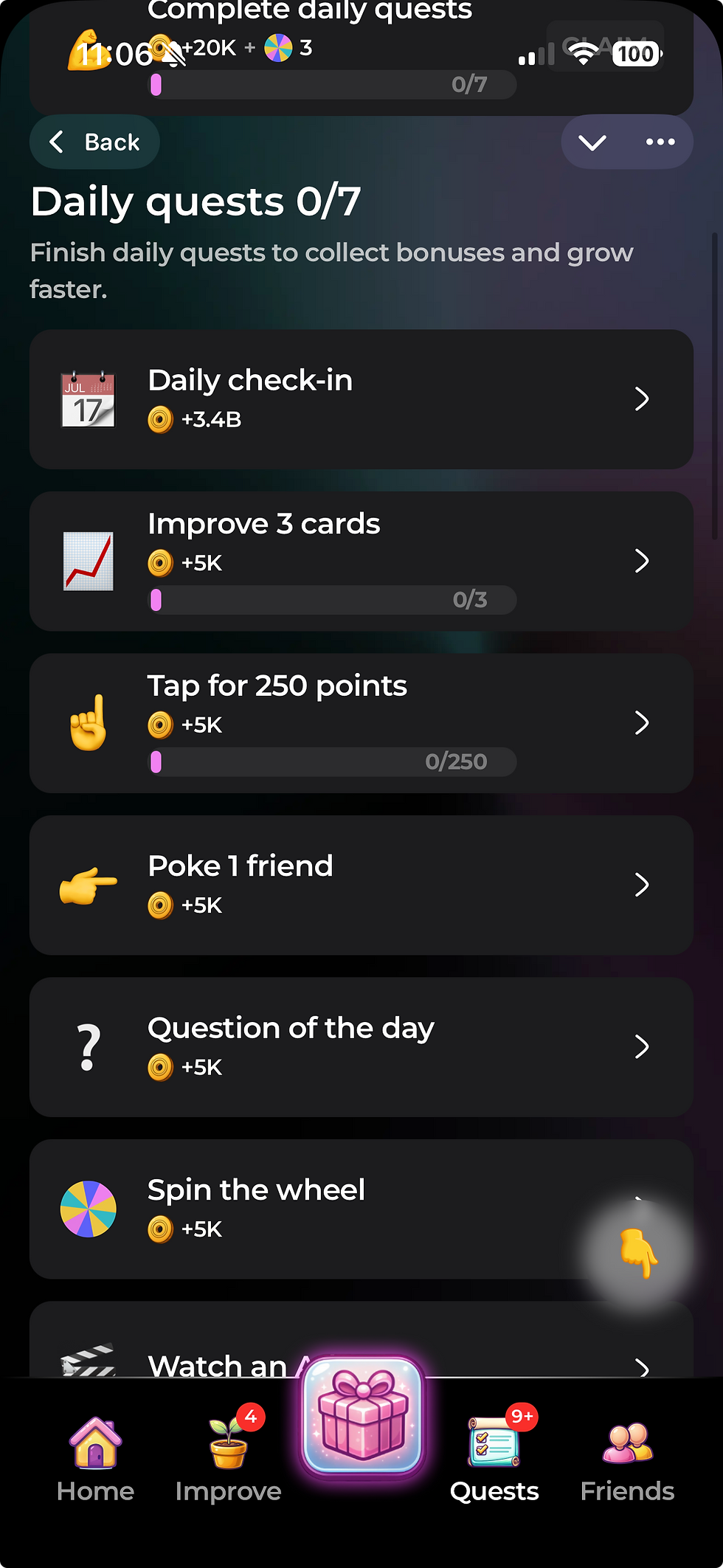


Daily systems added direction, novelty, and reward pacing without extending the core session.
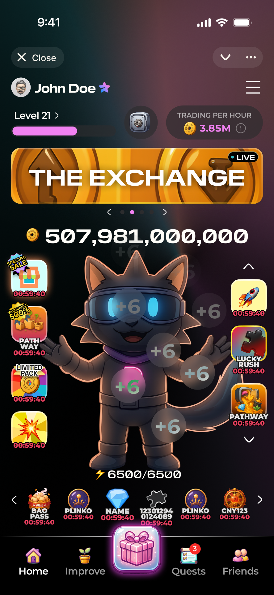
LIVEOPS & VIBECODING
Designing LiveOps as reusable product packages
1. Turning LiveOps into a configurable product system
To keep LiveOps fresh without rebuilding them from scratch, I treated them as reusable product packages rather than one-off features. Together with our backend team, I defined a NocoDB schema that describes each event in the same way—steps, costs, rewards, cosmetics, and timing—so a “Pathway” LiveOp becomes data the game can read and render. Over time, I pushed that into a reusable prompt framework where we could duplicate an event, change a handful of variables, and generate a new LiveOp from the same building blocks.
---
package: Badge Room — Trophy Cabinet
type: Reusable LiveOp package
surface: mobile-first iframe widget
authoring knobs: theme / thresholds / reward mix / pacing
---
<runtime_contract>
parent → widget: INIT_DATA / PROGRESS_UPDATE / PAYMENT_RESULT widget → parent: READY / CLAIM / CLOSE / HAPTIC raw payloads are normalized into a clean internal model
</runtime_contract>
<playable_logic>
players earn event currency and unlock badges sequentially claimable = next threshold reached with enough balance claimed badges update cabinet state and trigger celebration all-complete state opens final reward overlay
</playable_logic>
<experience_rules>
skeuomorphic 3D cabinet with glass shelves, jewel lights, pedestals mobile-first layout (~375px), HSL-only system, fixed CTA dimensions same package can be reused by changing theme, thresholds, and rewards
</experience_rules>
… plus visual direction, motion, contraints, and implementation layers
Package Metadata
Runtime Contract
Experience Rules
Authoring spec → Parent config →
LiveOp package → Player experience
Spec → Config → Package → Experience
A reusable LiveOps package defining logic, communication, and experience rules.
I designed this framework so LiveOps could be authored more like reusable packages than bespoke screens. Each package defines the event’s runtime contract, progression logic, and experience rules, while backend translates the spec into config and frontend renders it as a playable event. That made it possible to iterate at the speed of design decisions, keep the UX consistent across different themes, and create a foundation for future community-authored events without breaking the game’s structure.
Each package defined
-
event metadata
-
runtime communication
-
progression logic
-
reusable experience rules


Reusable package in NocoDB
LiveOp draft in Lovable

Shaped in Lovable, then structured in NocoDB as reusable LiveOp packages
Design → Structure
2. From reusable families to finished LiveOps
With the data layer in place, I used Lovable as an implementation-near design workspace to turn reusable families into polished LiveOps packages. Each family defined the core mechanic; my role was to shape the package layer on top—layout, narrative, hierarchy, states, progress, buttons, and feedback—until the LiveOp felt like a finished mini-game inside Dropee rather than a skinned template.
Starting from a base family file, I created new layouts, refined hierarchy, tuned spacing, and adapted states across themes until each package felt production-ready on mobile. I then connected it to NocoDB, tested it inside Dropee’s Telegram flow, and iterated on readability and feedback so one family could support multiple packages without extra engineering work.
Production assets and content are filled through NocoDB

Base family file from backend
→

LiveOp package designed in Lovable
Visual System & AI Art Direction
Building a reusable visual system with GenAI
On the visual side, I designed Dropee’s LiveOps graphics myself and used generative AI as a long-term collaborator tied to one coherent visual identity. I trained a dedicated Dropee V2 LoRA and used Scenario / Weavy to generate event-level assets—icons, backgrounds, badges, and screen art—that still read as Dropee no matter the theme.
For each event family—Valentine’s Day, Carnival, St. Patrick’s Day, Chinese New Year, and others—I defined a compact design kit: icon shapes, background composition, badge framing, and motion cues. From there, I generated themed asset packs, pulled them into Figma and Lovable, and tuned contrast, color, and depth so they worked as production UI assets rather than standalone illustrations.

Style rules + generation workflow

Assets prepared for LiveOps
Because the pipeline is so fast, I can prototype whole event looks in a day:
-
Generate a theme pack in Scenario with the Dropee V2 LoRA.
-
Drop assets into Figma and Lovable to skin a new LiveOp.
-
Wire the event via NocoDB and test it live on my phone.
This let us ship “games within the game” with distinct iconography, backgrounds, and badges while preserving one coherent Dropee visual language.
Because the pipeline is so fast, I can prototype whole event looks in a day:
-
Generate a theme pack in Scenario with the Dropee V2 LoRA.
-
Drop assets into Figma and Lovable to skin a new LiveOp.
-
Wire the event via NocoDB and test it live on my phone.
Assets prepared for LiveOps
This let us ship “games within the game” with distinct iconography, backgrounds, and badges while preserving one coherent Dropee visual language.
CX, Economy and TGE‑ready UX
Keeping the crypto layer optional but present
For many players, Dropee was “just a game” they opened between messages; for others, it was also a path into real token participation. I designed the crypto layer as optional but present: clearly signposted paths for learning about $DROPEE, joining airdrops, and connecting a wallet, all kept out of the way of players who only wanted to tap and play. The goal was to keep onboarding ultra-clean while making token depth feel like a natural continuation of the game rather than a hard mode-switch.
More broadly, I shaped the $DROPEE layer as a set of adjacent experiences that felt like extensions of Dropee rather than separate DeFi products. Inside the Telegram mini-app, players saw light-touch prompts—airdrop teasers, simple token explainers, and one primary next step. When they chose to go deeper, the presale launchpad and the airdrop claiming + staking dApp reused familiar game patterns like progress, rewards, and minimal forms, so connecting a wallet, depositing, claiming, or staking still read as managing progress in the Dropee world, not navigating a financial dashboard.

In-game token layer
From lightweight in-game prompts to deeper wallet flows, the token layer formed one continuous ownership journey.

Airdrop claiming + staking dApp

Presales launchpad
OUTCOMES & REFLECTION
What changed for players, the product, and my design approach
Dropee evolved from a simple tap-to-earn loop into one of Telegram’s most visible game ecosystems, with Daily Combo, Question of the Day, LiveOps events, and TGE-ready UX becoming part of how players understood “playing Dropee,” not just collecting a one-off reward. Season 2 proved that we could layer in airdrops, seasonal events, badges, and deeper progression systems while keeping the core loop lightweight, legible, and easy to return to.
More importantly, the project proved that a live game could grow across seasons and business milestones without forcing players to relearn the interface. As Lead Product Designer, I helped turn Dropee from a single game loop into a repeatable product system: one that could support new event structures, visual refreshes, token participation, and broader LiveOps ambitions while preserving trust in the core experience.

Core loop established
Daily systems and LiveOps layered in

A more deliberate multi-season system
It also changed how I think about design leadership. The challenge was not just shipping features, but building a system that could evolve without losing clarity. Dropee taught me how to balance stability and change at the same time: protecting the core loop, while creating room for new mechanics, business layers, and seasonal identity to emerge around it.
I design systems, not just screens—products that stay clear under real-world use.

